The website www.contantcontact.com gets a thumbs up for using principles of Neuro Web Design effectively.
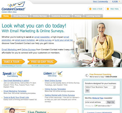
Look at their home page (www.constantcontact.com). On the home page is a large photo of a woman who looks really happy. In fact, she looks positively joyful.
Chapter 10 of Neuro Web Design describes the research on why pictures are so powerful at persuading at a website. The message on this home page is that this person is doing great things with this Constant Contact's software.
Next look at the large text that says "Look what you can do today! It's using the word "you" in large letters in the headline, which follows the principles in Chapter 6 on the Self. Using the word You (especially in large font size and in the headline) captures the attention of the unconscious. It tells the unconscious brain that there is something important on the page. You! You are ultimately all that matters to the unconscious, and using the word "You" in large letters gets that message across. The reaction will be for visitors to the site to (unconsciously) assume that the software is for them, and that the company has their best interest at heart.
There's a link in the top Navigation bar to Customer Examples. When you go to that page (http://search.constantcontact.com/customer-examples/index.jsp) there are stories of how customers have used the software in their businesses. This page uses principles from Chapter 2 in Neuro Web Design on Social Validation. The message is that other people are using this software, so many of them that they need a whole section of the website to talk about them.
At the Customer Example page, there are again pictures and stories (more Chapter 10). This time the pictures are of the emailing campaigns that customers implemented using the Constant Contact software.
Someone recommended that I check out Constant Contact (Chapter 2, Social Validation!). Once there it took me less than a minute to be persuaded to try their free trial. Their website is a great example of Neuro Web Design at work. A big "thumbs up" for Constant Contact's site.


No comments:
Post a Comment