Wednesday, December 24, 2008
Close Up Photos More Persuasive At A Charity Site
This holiday season someone gave me a gift certificate to donate to the charity of my choice at www.globalgiving.com. You can browse through hundreds of worldwide charities and donate to the organization of your choice. Of course while browsing I noticed that some organizations were more persuasive than others. Some used photos very effectively, like the one above with the close up of a smiling girl. But in other instances the photos were not as powerful. In the second photo here the girls are too far from the camera to see their face. It's not as powerful or persuasive. To make a plea for donation you need to show human faces that are showing human emotion. What better use of persuasion than at a site like this!
Friday, December 12, 2008
Thumbs Up: Credo mobile email hits 5 Persuasion hot buttons
I get plenty of marketing emails, and this one that came the other day really stood out. Credo Mobile... it's a cell phone service provider that also promises political change! They use 5 different persuasion techniques, all on one page:
1. The word "Free" is very powerful and they use it several times
2. Scarcity -- "Offer Expires..."
3. Association -- They are a politically active company, and they talk about Barack Obama on the page... they are associating themselves with Obama... like Obama, then you will like them
4. Consistency -- The message is: If you are someone who cares about being progressive, then you want to (be consistent) and use a progressive cell phone service provider.
5. Social Validation - -The bottom ofthe page has a customer testimonial, with a name and photo.
Good job hitting persuasion marks Credo!
Monday, December 8, 2008
Sexy Product Needs a Sexier Web Site
PNC bank has created a unique offering for people in their 20s (Generation Y). It really is different, and it's getting a lot of press. But they seem to have missed the boat at their website.
This is a great example of the concept of "the home page is dead". At their home page (first picture) you'd be hard pressed to find the link to virtual wallet, (it's a small item in one of the lists) and they sure haven't used Neuro Web Design techniques to persuade people to go there. They'll tell you that they designed a special web site for the product and that their marketing takes people to that website. You'd think they would give it a little play on the home page, using a picture of a 20 year old who is happy with a link there to the product.
If you do make your way to the special virtual wallet site (second picture) you'll find a site with moving graphics and a lot of text. It looks like it was created by Gen X people for Gen X people... again, no principles of Neuro Web Design... where are the pictures of 20 year olds? Where are the stories of real people with real photos of them talking about how virtual wallet has changed their life? Where is the social networking? PNC will create a big splash with their marketing, but eventually it will fall short. They need to use make use of unconscious persuasion techniques for Virtual Wallet to stick.
Tuesday, December 2, 2008
Thumbs Up: Website Uses Principles of Persuasion
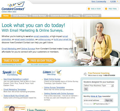
The website www.contantcontact.com gets a thumbs up for using principles of Neuro Web Design effectively.
Look at their home page (www.constantcontact.com). On the home page is a large photo of a woman who looks really happy. In fact, she looks positively joyful.
Chapter 10 of Neuro Web Design describes the research on why pictures are so powerful at persuading at a website. The message on this home page is that this person is doing great things with this Constant Contact's software.
Next look at the large text that says "Look what you can do today! It's using the word "you" in large letters in the headline, which follows the principles in Chapter 6 on the Self. Using the word You (especially in large font size and in the headline) captures the attention of the unconscious. It tells the unconscious brain that there is something important on the page. You! You are ultimately all that matters to the unconscious, and using the word "You" in large letters gets that message across. The reaction will be for visitors to the site to (unconsciously) assume that the software is for them, and that the company has their best interest at heart.
There's a link in the top Navigation bar to Customer Examples. When you go to that page (http://search.constantcontact.com/customer-examples/index.jsp) there are stories of how customers have used the software in their businesses. This page uses principles from Chapter 2 in Neuro Web Design on Social Validation. The message is that other people are using this software, so many of them that they need a whole section of the website to talk about them.
At the Customer Example page, there are again pictures and stories (more Chapter 10). This time the pictures are of the emailing campaigns that customers implemented using the Constant Contact software.
Someone recommended that I check out Constant Contact (Chapter 2, Social Validation!). Once there it took me less than a minute to be persuaded to try their free trial. Their website is a great example of Neuro Web Design at work. A big "thumbs up" for Constant Contact's site.
Subscribe to:
Posts (Atom)